Luxury Home Color Trends for Modern Spaces
Okay, confession time: I'm sitting here in my oldest flannel pajamas (the ones with the tiny hole near the pocket that I refuse to throw away), staring at my living room wall. It's been "Agreeable Gray" for three years now. Three. Years. And while Benjamin Moore promised it would be, well, agreeable, I'm starting to feel like I'm living inside a cloud on a particularly boring Tuesday.
Last weekend, I found myself in one of those rabbit holes—you know the type—where you start by looking up "how to remove coffee stains from carpet" and somehow end up on a French interior designer's Instagram at 2 AM. That's when it hit me: luxury home color trends have completely shifted while I've been playing it safe with my fifty shades of beige. The modern spaces I was drooling over? They were brave. Bold. Alive.
So here I am, coffee number two in hand (in my favorite chipped mug, naturally), ready to spill everything I've learned about what's actually happening in the world of upscale color design right now. And trust me, it's way more exciting than my gray walls would have you believe.
The Death of All-White Everything (Thank Goodness)
Remember when every luxury home looked like it was auditioning for a toothpaste commercial? Yeah, those days are officially over. Don't get me wrong—I tried the all-white thing. For about six months, my kitchen looked like a pristine laboratory. Then real life happened. Spaghetti sauce happened. My nephew's sticky fingers happened.
Today's luxury home color trends are embracing what I like to call "livable elegance." Think warm, earthy neutrals that don't show every speck of dust. I'm talking about colors like:
- Warm terracotta (imagine sunset hitting adobe walls)
- Soft sage (like that expensive matcha latte you treat yourself to)
- Creamy caramel (basically the color of perfectly browned butter)
- Dusty rose (sophisticated, not precious)
The shift makes sense when you think about it. We're all spending more time at home, and stark white walls can feel about as cozy as a hospital waiting room after hour three.
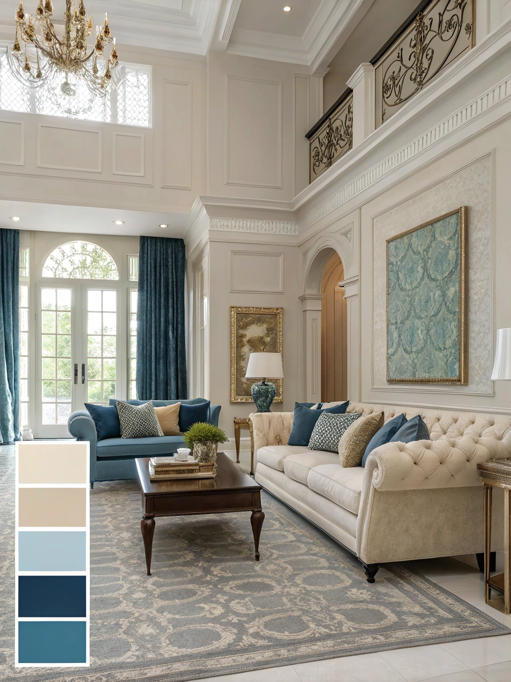
Rich Jewel Tones Are Having Their Moment
Here's something that surprised me: deep, moody colors are no longer reserved for that one dramatic powder room. Luxury spaces are going full emerald, sapphire, and amethyst—and not in a way that screams "1980s revival gone wrong."
I recently visited a friend's newly renovated townhouse (she's one of those people who actually follows through on Pinterest boards), and her dining room walls were painted in the deepest forest green I've ever seen. Farrow & Ball's "Studio Green," she told me, while I tried not to look too jealous. The crazy part? It worked. With brass fixtures catching the light and a worn leather chair tucked in the corner, the whole room felt like you'd stumbled into some secret club in London.
How to Pull Off Jewel Tones Without Going Overboard
- Start with one wall (your "statement wall," if we're being fancy about it)
- Balance with natural textures—think rough linen curtains or a jute rug
- Add metallic accents but keep them warm (brass, copper, aged gold)
- Layer in plenty of lighting—these colors eat light for breakfast
The "Warm Minimalism" Revolution
Minimalism got a bad rap for being cold and uninviting. (Guilty—I once described a friend's minimalist apartment as "aggressively sparse.") But the new wave of luxury home color trends has figured out how to keep things simple without feeling like you're living in an art gallery after closing time.
Picture this: walls in the palest peachy-pink, so subtle you're not even sure if it's pink or if the afternoon light is just doing something magical. A chunky knit throw blanket the color of oatmeal draped over a camel-colored sofa. Maybe there's a stack of design books (slightly askew, because perfection is overrated) on a walnut side table.

This is warm minimalism—refined but not rigid, sophisticated but still somewhere you'd want to eat takeout in your sweats.
Nature-Inspired Palettes (But Make It Luxury)
I've always been skeptical of "bringing the outdoors in"—mainly because my attempts at keeping houseplants alive have been… let's say "unsuccessful." But the current luxury color trends are taking inspiration from nature in a way that doesn't require a green thumb.
We're seeing colors like:
- Mushroom gray (more interesting than it sounds, I promise)
- Moss green (without the dampness)
- Sky blue (but the moody, storm-is-coming version)
- Sand beige (think Malibu beach house, not sandbox)
The trick is layering these colors with different textures. That mushroom gray looks incredible on walls when you add a velvet sofa in sage green, maybe toss in some raw linen pillows. Suddenly, your living room feels like that expensive spa where they serve cucumber water and play rain sounds.
Bold Black Accents Are Everywhere
Five years ago, if you'd told me black walls would be trending in luxury homes, I would've assumed we'd all collectively lost our minds. But here we are, and honestly? I'm kind of into it.
Not full goth mode—we're talking strategic use of black to ground a space. Black window frames (SO good), a black accent wall behind floating oak shelves, or even black kitchen cabinets paired with marble countertops and brass hardware. It's dramatic without being theatrical, if that makes sense.
Making Black Work in Your Space
The key is balance. My neighbor painted her home office in "Railings" by Farrow & Ball (yes, the same neighbor—she's very committed to that brand), and instead of feeling cave-like, it's incredibly cozy. She balanced it with:
- A massive window (natural light is crucial)
- Warm wood desk
- Plenty of brass and gold accents
- Art with pops of color
The Unexpected Return of Pastels (But Grown Up)
Pastels are back, but they've been hitting the gym and drinking green juice. These aren't your nursery pastels—they're muted, sophisticated, and somehow masculine and feminine at the same time.
Think:
- Dusty lavender (like dried flowers, not Easter eggs)
- Sage mint (more herb garden, less toothpaste)
- Blush pink (barely there, like you're embarrassed to admit it's pink)
- Soft ochre (sunshine, but make it moody)
I painted my powder room in Benjamin Moore's "Misty Blush" last month (finally, some action on the paint front!), and every guest comments on it. It's pink enough to be interesting but neutral enough that my husband didn't revolt.
Color Drenching: The Brave New World
This might be the most intimidating trend, but stick with me. Color drenching is exactly what it sounds like—painting your walls, ceiling, trim, and sometimes even furniture in the same color. Or at least the same color family.
I saw this in person at a boutique hotel in Portland (yes, I'm that person who takes photos of hotel bathrooms for "inspiration"). The entire bathroom was various shades of sage green—walls, ceiling, even the vanity. Instead of feeling overwhelming, it was like being wrapped in the world's most expensive blanket.
The secret? Choose mid-tone colors (nothing too light or dark) and vary the finishes. Matte walls, semi-gloss trim, maybe a glossy ceiling if you're feeling wild.
Earth Tones 2.0: Beyond Beige
We need to talk about the new earth tones because they're nothing like the builder beige that haunted the early 2000s. These colors have depth, personality, and—dare I say—sex appeal?
Current favorites include:
- Cognac (like expensive leather)
- Rust (the good kind, not the car kind)
- Olive (military chic, but make it cozy)
- Umber (chocolate, but sophisticated)
These colors work incredibly well with natural materials. Picture cognac-colored walls with a live-edge walnut coffee table, maybe a sheepskin rug thrown in for good measure. It's luxury cabin meets city penthouse.
Monochromatic Schemes That Actually Work
I used to think monochromatic meant boring. One color? For everything? Pass. But the current approach to monochromatic design in luxury homes is more like a symphony in one key—variations on a theme that create depth and interest.
Take gray (I know, I know, but hear me out). Instead of my flat "Agreeable Gray" situation, imagine:
- Charcoal gray sofa
- Dove gray walls
- Pewter gray curtains
- Silver gray throw pillows
- Slate gray area rug
Suddenly, you've got a room with dimension, not a study in monotony. The same principle works with any color family—blues, greens, even pinks if you're brave enough.
Two-Toned Rooms: The New Classic
This trend makes my indecisive heart so happy. Can't choose between two colors? Use both! But we're not talking about accent walls (though those are fine). This is about dividing your room horizontally—typically darker on bottom, lighter on top.
I'm currently obsessed with rooms that have deep navy or forest green on the lower half and creamy white or pale pink on top. Add some wall molding at the division point (chair rail height, usually), and suddenly you look like you hired an interior designer. The visual weight grounds the room while keeping it from feeling heavy.
Wrapping Up: Your Color Journey Starts Now
So here's the thing about luxury home color trends—they're not rules, they're invitations. An invitation to be braver than beige. To try that color you've been secretly crushing on. To finally paint over that builder-grade whatever that's been bothering you for years.
I'm starting small. That powder room victory has emboldened me to consider—just consider—painting my dining room in a deep, moody blue. Maybe Clare's "Current Mood" or Benjamin Moore's "Hale Navy." Baby steps, right?
The real luxury in these color trends isn't about spending a fortune on designer paint (though if you can swing that Farrow & Ball, more power to you). It's about creating spaces that feel intentional, personal, and yes, a little bit brave. Spaces that make you smile when you walk in, even in your rattiest pajamas with your third cup of coffee.
Your walls are waiting. What story do you want them to tell?
Now if you'll excuse me, I have some paint samples to order and some "Agreeable Gray" to finally say goodbye to. Wish me luck.